Table of Contents
- Executive Summary
- Chapter 1: Why Python Dominates Security Data Science
- Chapter 2: NumPy - Supercharging Security Data Processing
- Chapter 3: Pandas - Your Security Data Command Center
- Chapter 4: Core Visualization and Plotting with Matplotlib
- Chapter 5: Advanced Statistical Graphics with Seaborn
- Chapter 6: Preprocessing and Feature Engineering
- Chapter 7: Case Study I - CICIDS2017 Dataset
- Chapter 8: Case Study II - UNSW-NB15 Dataset
- Chapter 9: Synthesis and Strategic Recommendations
Executive Summary
Python for Security
Python ecosystem provides powerful tools for security automation, from packet analysis to machine learning-based detection.
Cybersecurity drowns in data. Your network spits out millions of events daily, and traditional detection just looks for known bad patterns while attackers use AI to speed up their attacks, shifting the balance of power in their favor unless you adapt quickly.
You need AI-powered defense. Python's data science tools deliver exactly that capability with unprecedented speed and power. NumPy handles massive datasets in milliseconds where traditional methods take hours. Pandas transforms messy, chaotic logs into clean, actionable intelligence. Matplotlib and Seaborn reveal hidden patterns that slip past human analysis, patterns that mark the difference between catching an attack in progress and discovering a breach months later.
This guide demonstrates precisely how security teams leverage these tools to stop real attacks before they cause damage. We'll walk through the complete workflow: ingesting raw network data from production environments, cleaning those notoriously messy logs that plague every security operation, engineering features that expose attacker behavior patterns, and building machine learning models that deliver real-world results in operational environments.
What You'll Master:
- NumPy for high-speed security data processing
- Pandas for log analysis and threat hunting
- Matplotlib for detailed incident reporting
- Seaborn for rapid pattern discovery
- Real-world techniques using CICIDS2017 and UNSW-NB15 datasets
The Bottom Line: Most teams misunderstand AI security completely. They chase fancy algorithms. They obsess over neural network architectures. They miss the fundamental truth: success lives in the data preparation phase, not the modeling phase, and when you truly understand your data at a deep, intuitive level, even simple models outperform complex ones with shocking consistency. This guide teaches you to think like an attacker first, then build defenses that move faster than threats evolve.
Real Impact: Organizations using these techniques see dramatic improvements across their security posture. Detection rates jump 40-60% as systems catch threats that previously slipped through unnoticed. False positives drop 75%, freeing analysts from alert fatigue and allowing them to focus on genuine threats that require human expertise. Want to stop reacting to yesterday's attacks and start preventing tomorrow's? This is how.
Chapter 1: Why Python Dominates Security Data Science
1.1 When Signatures Fail, Data Science Saves
Attackers move fast. New malware variants emerge hourly, fresh attack methods bypass traditional controls daily, and threat actors continuously discover novel ways to abuse legitimate functionality that security tools explicitly trust.
Traditional detection fails here. It looks for known patterns. It matches signatures. It catches yesterday's attacks while today's threats waltz past unchallenged, exploiting the fundamental weakness of pattern-matching approaches that can only detect what they've seen before.
Consider Colonial Pipeline. Attackers compromised a VPN password. They logged in through legitimate channels. No signature in existence could flag this as malicious because the login looked totally normal, indistinguishable from authorized access patterns that occur thousands of times daily across enterprise networks.
Smart security teams figured this out years ago. Instead of asking "Have we seen this attack signature before?" they ask "Does this behavior match normal patterns for this user, this system, this time of day?" Machine learning models learn normal baselines through observation, then flag deviations that suggest compromise even when those deviations involve entirely novel attack techniques.
The Data Science Advantage:
AI examines millions of network flows simultaneously, spotting correlations humans miss entirely. Like unusual login times combined with atypical data access patterns. Or DNS queries exhibiting the statistical signatures that scream "command and control server" to algorithms trained on behavioral patterns rather than static indicators.
Here's the secret nobody tells you: the algorithm matters far less than you think. Success flows from good data preparation and intelligent feature engineering, the unglamorous work that transforms raw network packets into features that make malicious activity mathematically obvious. Python makes this transformation accessible to security professionals who understand networks but lack computer science PhDs.
Why Security Analysts Beat Pure Data Scientists:
Data scientists see columns and numbers. Security analysts recognize port scans by their behavioral signatures. They engineer features that make port scanning obvious to machine learning algorithms because they understand the attack at a fundamental level. Security domain knowledge combined with Python tools creates detection systems that actually work in production rather than just publishing well in papers.
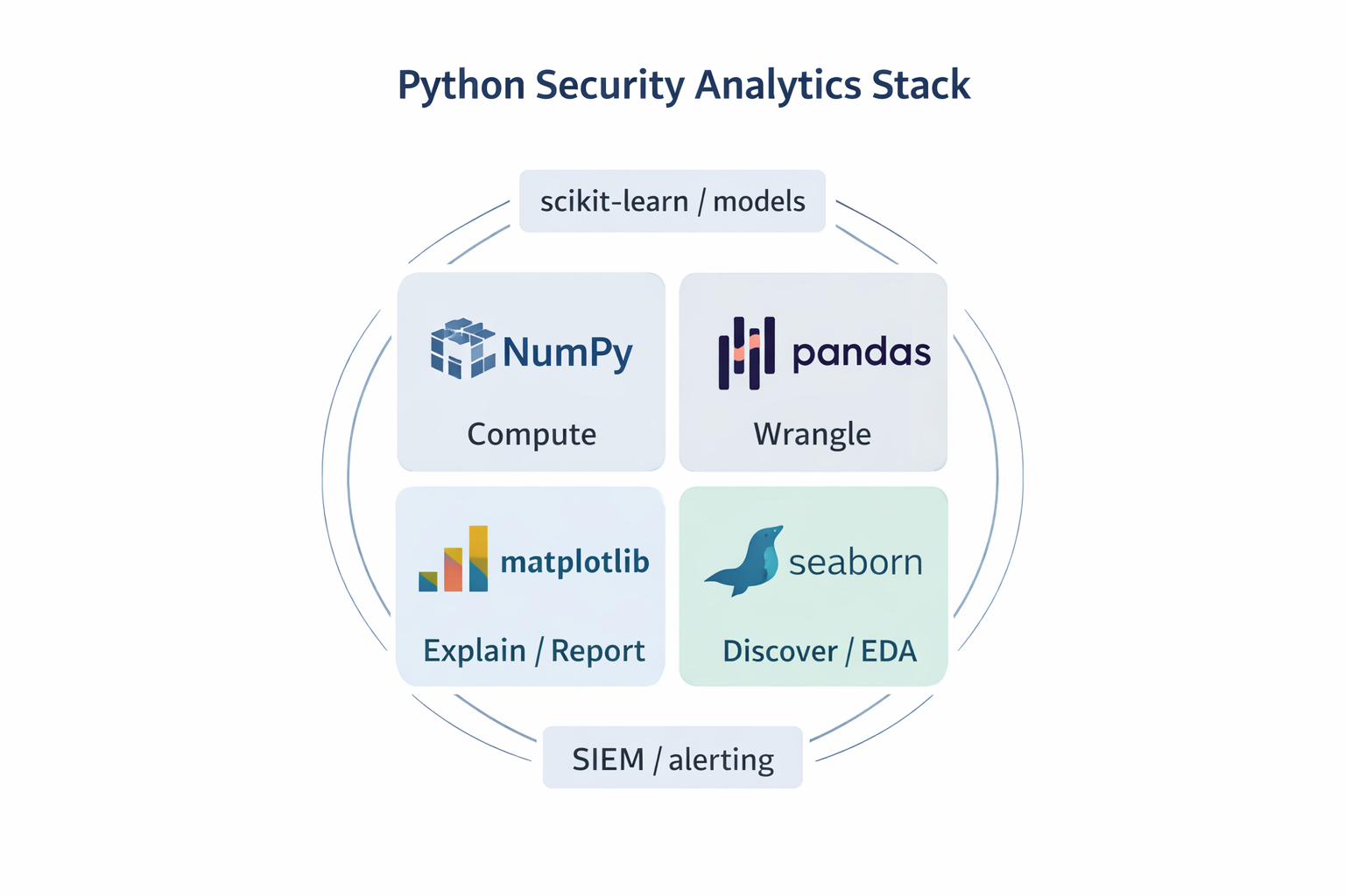
1.2 Your Python Security Arsenal: Four Essential Tools
Four Python libraries power virtually every AI security system in production today. Master these tools and you can analyze any security dataset, whether you're examining firewall logs, analyzing malware samples, or hunting threats across petabytes of network telemetry.
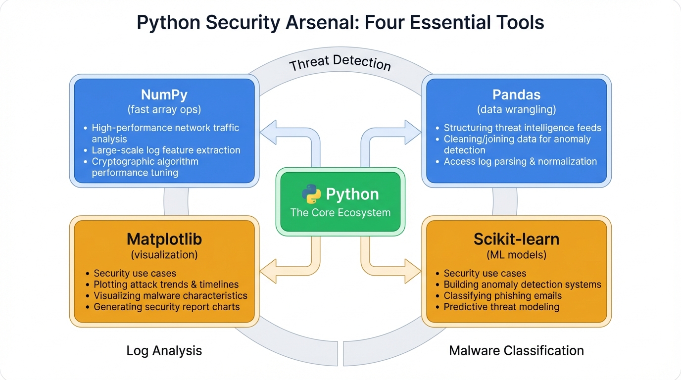
NumPy: The Speed Engine
NumPy transforms impossibly slow Python operations into blazing fast computations. Processing millions of network flows? NumPy turns hours into minutes through vectorized operations that leverage CPU-level optimization. Everything else in the ecosystem builds on this foundation.
# Process millions of packet sizes in milliseconds
packet_sizes = np.array([1500, 64, 1200, 128, 1500])  # Actual data would be millions of values
average_size = np.mean(packet_sizes)  # Lightning fast
Pandas: The Data Wrangler
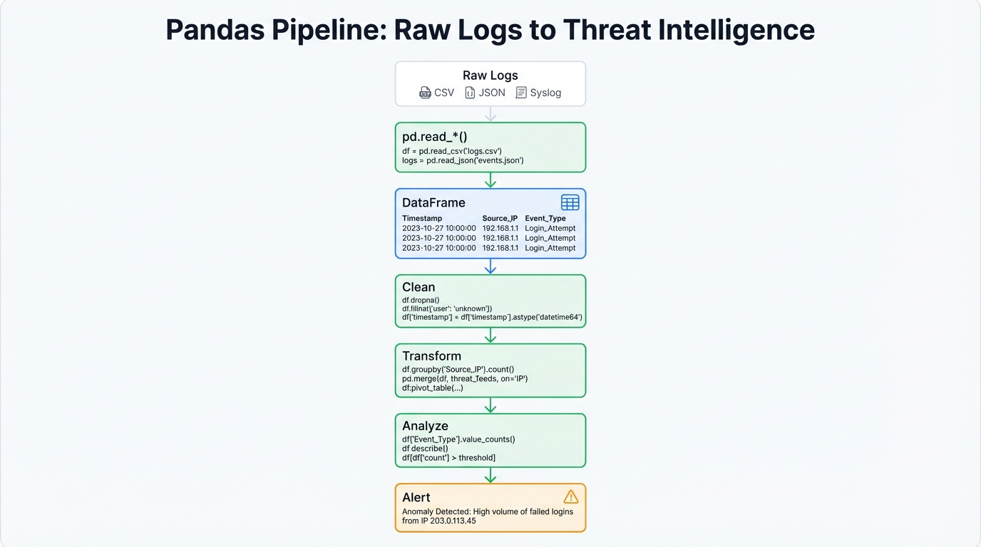
Security logs arrive messy. Different formats clash. Fields vanish randomly. Timestamps make no logical sense. Pandas transforms this chaos into clean datasets that machine learning models consume, like Excel for programmers but exponentially more powerful and infinitely more flexible.
# Transform raw firewall logs into structured threat intelligence
firewall_logs = pd.read_csv('firewall_today.log')
suspicious_ips = firewall_logs[firewall_logs['blocked_packets'] > 1000]
Matplotlib: The Report Generator
Executives need clear incident briefings, not raw data dumps. Matplotlib creates professional visualizations that communicate security events clearly, with complete control over every visual element ensuring your threat briefings look polished and convey critical information without ambiguity.
Seaborn: The Pattern Detector
Need to spot correlations between attack types and time of day? Seaborn generates the visualization in three lines of code, perfect for threat hunting where rapid iteration through hypotheses separates successful investigations from endless dead ends.
# Instantly visualize attack patterns
sns.heatmap(attack_data.corr(), annot=True)
plt.title('Attack Pattern Correlations')
plt.show()
These tools work together seamlessly. Each brings specialized capabilities. Each excels at specific tasks. Together they form a comprehensive platform for security analytics that scales from individual investigations to enterprise-wide threat detection.
| Library | What It Does | When You Use It | Security Superpowers |
|---|---|---|---|
| NumPy | Lightning-fast number crunching | Processing millions of network events | Turn 4-hour analysis into 4-minute analysis; enables real-time threat detection on enterprise-scale data streams. |
| Pandas | Data cleaning and analysis | Reading logs, filtering threats, grouping attacks | Transform messy firewall logs into clean datasets; find all port scans in seconds with .groupby() magic. |
| Matplotlib | Professional visualizations | Executive briefings, incident reports | Create publication-quality threat timeline charts that executives actually understand and act on. |
| Seaborn | Rapid pattern discovery | Threat hunting, exploratory analysis | Spot attack correlations in minutes, not hours; generate statistical plots that reveal hidden threat patterns. |
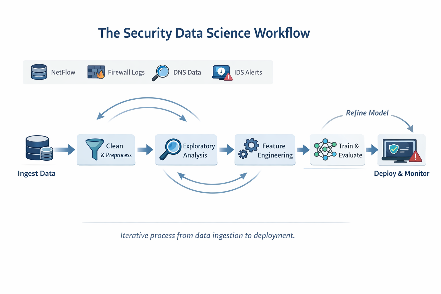
1.3 The Security Data Science Workflow That Actually Works
Most tutorials skip the chaos. They ignore the reality that security data arrives incomplete, contradictory, and saturated with false signals that drown out genuine threats.
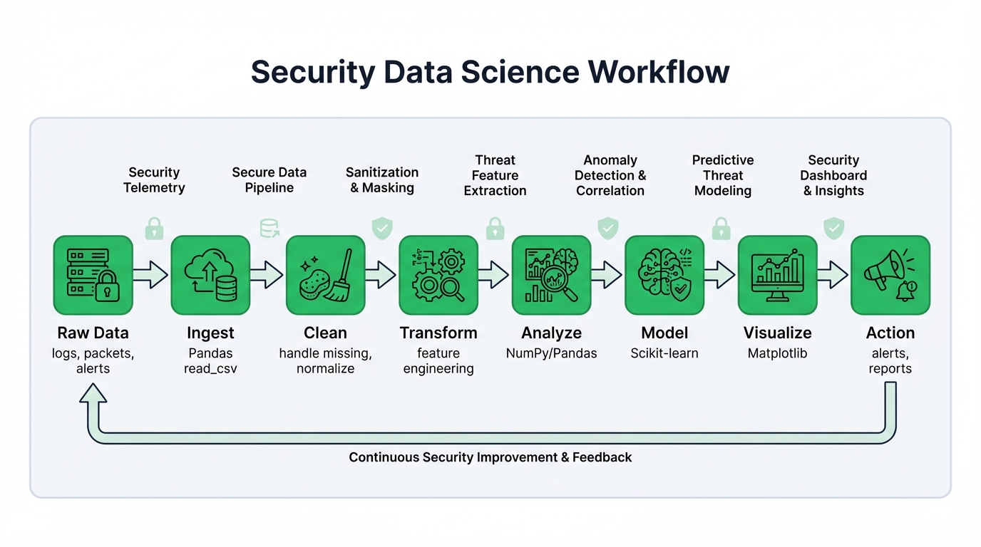
Here's the battle-tested workflow that transforms network chaos into actionable threat intelligence:
Step 1: Data Ingestion (The Easy Part)
Load raw data into Pandas DataFrames. Firewall logs. IDS alerts. DNS queries. Network flows. Everything starts here with simple file reads.
firewall_logs = pd.read_csv('firewall_logs.csv')
ids_alerts = pd.read_json('intrusion_alerts.json')
Step 2: Data Cleaning (Where Most Projects Die)
Security data is dirty. Missing timestamps plague event logs. IP formats clash across different systems. Corrupted entries scatter throughout datasets. This phase separates successful projects from abandoned efforts, and expect to invest 60-80% of your time here because rushing through cleaning guarantees model failures later.
Step 3: Exploratory Data Analysis (The Detective Work)
Security expertise matters here more than anywhere else. You're hunting attack patterns, not just examining statistical distributions or calculating summary statistics that tell you nothing about adversary behavior. Seaborn and Matplotlib reveal threats your SIEM missed entirely.
Step 4: Feature Engineering (The Secret Sauce)
Raw logs hide attacker behavior. You must engineer features that expose malicious activity: packets per second during login attempts, deviation from baseline user behavior, DNS query entropy that signals domain generation algorithms. These engineered features make attacks mathematically obvious to even simple models.
Step 5: Model Training (Finally, The AI Part)
Clean data plus smart features make even simple models effective. Complex algorithms can't fix poor preparation. A well-engineered dataset fed to logistic regression outperforms a deep neural network trained on garbage, every single time without exception.
The Reality Check:
This workflow isn't linear. You'll loop back constantly as new insights emerge. A visualization reveals data quality issues you missed initially. Poor model performance points to missing features you should have created earlier. Failed deployments expose edge cases your testing never covered. This iterative cycle separates working production systems from research demos that look impressive in slides but fail when facing real attacks.
Pro Tip: Start simple. Get basic analytics operational before attempting sophisticated machine learning models. Many security teams solve 80% of their threat detection needs with well-engineered Pandas queries that run in seconds and require zero model training.
Chapter 2: NumPy - Supercharging Security Data Processing
2.1 Why NumPy Arrays Beat Python Lists for Security Data
When analyzing millions of network flows, performance transcends academics. It determines survival. NumPy arrays process security data 10-100x faster than Python lists, and understanding why this speed advantage exists transforms how you architect detection systems.
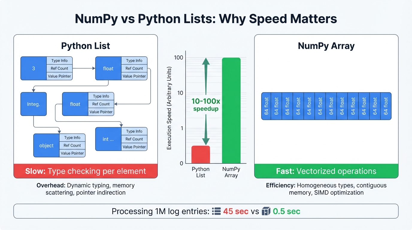
The Speed Secret: Memory Layout
Python lists store elements as scattered objects across memory. Every operation requires pointer chasing and type checking in slow interpreted code. NumPy arrays pack data contiguously in memory as raw numbers, then process operations through optimized C code that executes at near-hardware speeds.
Real-World Impact:
- Processing 1 million packet sizes: Python lists take 2 minutes, NumPy takes 2 seconds
- Calculating network flow statistics: Lists need hours, NumPy needs minutes
- Real-time threat detection: Only possible with NumPy's speed
The Trade-off: Homogeneous Data
NumPy demands all elements share the same type. All integers. All floats. No mixing. This restriction enables the speed, and for security data this constraint works perfectly since packet sizes are numbers, timestamps are numbers, byte counts are numbers.
# This is fast - homogeneous numeric data
packet_sizes = np.array([1500, 64, 1200, 576, 1500])  # All integers

# This won't work - mixed types
# mixed_data = np.array([1500, "TCP", 192.168.1.1])  # Error!
When It Matters Most: Real-time intrusion detection systems process network flows as they stream from sensors. Without NumPy's speed, you're analyzing historical data while attacks execute in real time, always one step behind adversaries who move at network speeds.
Essential Array Properties Every Security Analyst Needs:
.ndim- How many dimensions? (1D for a list of IPs, 2D for a table of network flows).shape- Array dimensions (1000 flows × 10 features = shape (1000, 10)).size- Total number of elements (useful for memory estimation).dtype- Data type (int64, float32, etc. - affects memory usage and precision)
import numpy as np

# Create network flow data: [duration, packets_per_second, total_bytes]
# Real datasets would have millions of these flows
flow_data = np.array([
    [10.5, 2.0, 1200],    # Normal web browsing
    [5.2, 1.0, 600],      # Email check
    [120.0, 60.0, 72000], # Suspicious: high rate + large transfer
    [0.1, 1000.0, 50000]  # Port scan: short duration, many packets
], dtype=np.float64)

print(f"Analyzing {flow_data.ndim}D network flow data")
print(f"Shape: {flow_data.shape} ({flow_data.shape[0]} flows, {flow_data.shape[1]} features)")
print(f"Total data points: {flow_data.size}")
print(f"Memory efficient type: {flow_data.dtype}")

# Output:
# Analyzing 2D network flow data
# Shape: (4, 3) (4 flows, 3 features)
# Total data points: 12
# Memory efficient type: float64
Real-World Context: This tiny example represents the structure of massive security datasets. CICIDS2017 contains 2.8 million network flows. UNSW-NB15 has 2.5 million. NumPy makes analyzing these datasets practical.
2.2 Creating Security Arrays and Broadcasting Power
Security datasets often need specific array structures. NumPy makes this easy with specialized creation functions:
# Create a 3x4 array of zeros
zeros_array = np.zeros((3, 4))

# Create an array of 5 evenly spaced values from 0 to 10
linspace_array = np.linspace(0, 10, num=5)
print(f"Linspace array: {linspace_array}")
Arrays reshape and combine flexibly. The reshape() method changes array shape without changing underlying data, while functions like np.concatenate(), np.vstack() (vertical stack), and np.hstack() (horizontal stack) merge multiple arrays into unified structures.
Broadcasting represents NumPy's most powerful feature. It defines rules for operations on arrays with different but compatible shapes, performing implicit data replication behind the scenes instead of forcing you to write explicit loops that bloat code and kill performance. Two dimensions are compatible when they're equal or when one of them is 1.
# Example of broadcasting
# A 3x3 array representing packet counts for 3 flows over 3 seconds
packet_counts = np.array([
    [100, 150, 200],
    [50, 75, 100],
    [300, 250, 180]
])

# A 1D array representing a normalization factor for each flow
normalization_factor = np.array([0.5, 0.8, 0.1])

# The normalization_factor array (shape 3,) is broadcast across the
# columns of packet_counts (shape 3,3) without an explicit loop.
# It is treated as if it were a 3x1 array.
normalized_counts = packet_counts * normalization_factor[:, np.newaxis]
print("Normalized Packet Counts:\n", normalized_counts)
2.3 Vectorized Operations: Why Speed Matters in Security
Vectorization is NumPy's secret weapon. Instead of processing network flows one by one through slow Python loops, vectorized operations crunch millions of flows simultaneously, and this isn't just convenient—it's the difference between real-time threat detection and batch processing that always lags behind attackers.
All standard arithmetic operators (+, -, *, /) and a vast library of universal functions (ufuncs) like np.sin(), np.exp(), and logical operators (>, <, ==) work vectorized.
import numpy as np

# Example: Calculate packet rate from total packets and duration
# Imagine these are columns from a large network traffic dataset
total_packets = np.array([200, 50, 3600, 2000, 500, 1000, 800, 18000])
flow_duration_sec = np.array([2, 1, 60, 2, 10, 0.5, 5, 60])

# To avoid division by zero, we'll replace zero durations with a small number
flow_duration_sec[flow_duration_sec == 0] = 1e-6

# A single vectorized operation replaces a Python for loop
packet_rate = total_packets / flow_duration_sec
print(f"Packet Rate (packets/sec): {packet_rate}")

# Vectorized logical operations can create boolean masks for filtering
high_rate_flows = packet_rate > 100
print(f"Flows with high packet rate: {high_rate_flows}")
print(f"Packet counts for high-rate flows: {total_packets[high_rate_flows]}")
The performance gap between vectorized NumPy operations and Python loops is staggering. For arrays with millions of elements, vectorized multiplication runs orders of magnitude faster, transforming analyses that would consume hours into tasks completed in seconds and making near-real-time monitoring and large-scale historical analysis actually feasible in production environments.
2.4 Real Security Applications: From Raw Packets to Threat Intelligence
Real-world security datasets contain numerical features that expose attacker behavior:
Flow-Level Features (Per Network Conversation):
- Flow duration (attackers often have timing signatures)
- Packet counts (port scans = many small packets)
- Byte transfers (data exfiltration = large outbound flows)
- Packet size distributions (malware often uses specific sizes)
- Timing patterns (beaconing has regular intervals)
Why These Features Matter:
- Port scans: Short duration, many packets, small bytes
- Data exfiltration: Long duration, balanced packets, large bytes
- C2 beaconing: Regular intervals, consistent packet sizes
- Normal browsing: Variable timing, mixed packet sizes
When loaded for analysis, these numerical columns become NumPy arrays naturally. This enables high-speed vectorized calculations for cleaning data, normalizing features, or engineering new, more powerful indicators. Calculate bytes per packet for millions of flows with a single line.
NumPy's advanced capabilities like Fast Fourier Transform (np.fft) open doors to sophisticated signal processing techniques. Network traffic becomes time-series signal data, and Fourier analysis identifies periodicities indicating automated malicious activity like command-and-control beaconing. While specialized, these applications build upon the same foundational ndarray object and efficient computational engine.
Chapter 3: Pandas - Your Security Data Command Center
3.1 DataFrames and Series: Structured Thinking for Security Data
NumPy provides raw computational power. Pandas provides structure and semantic context necessary for practical analysis, built atop NumPy and introducing two indispensable data structures: Series and DataFrame.
- Series: A one-dimensional labeled array holding any data type. Conceptually similar to a spreadsheet column, each element associates with a label in the Index.
- DataFrame: A two-dimensional size-mutable, potentially heterogeneous tabular structure with labeled axes for rows (Index) and columns. Think of it as a dictionary of Series objects where each Series is a column. Perfectly suited for security datasets typically provided as CSV files.
Pandas' true power lies in attaching meaningful labels to raw numerical data. This elevates analysis from manipulating anonymous arrays to working with conceptually meaningful data. You're no longer dealing with the third column of a NumPy array; you're working with the 'Destination Port' Series within a DataFrame of network flows. This semantic richness makes code more readable, less error-prone, and aligned with how security analysts think.
import pandas as pd

# Create a dictionary of data
data = {
    'Source IP': ['192.168.1.10', '10.0.0.5', '192.168.1.10', '203.0.113.8'],
    'Destination Port': [80, 443, 22, 53],
    'Protocol': ['TCP', 'TCP', 'SSH', 'UDP'],
    'Total Bytes': [1500, 2048, 512, 256]
}

# Create a DataFrame from the dictionary
df = pd.DataFrame(data)

print("Pandas DataFrame:")
print(df)
print("\nData type of 'Protocol' column:")
print(type(df['Protocol']))  # This is a Pandas Series
3.2 Data Ingestion and Cleaning: Handling Raw Network Logs
A security analyst's first task almost always involves loading data from external sources. Pandas excels here with a suite of read_* functions for various formats, with pd.read_csv() being most common for IDS datasets.
Real-world security data rarely arrives pristine. Network logs suffer from inconsistencies, missing values, corrupted entries. Pandas provides comprehensive cleaning tools:
- Inspecting Data: Functions like
.info()provide concise DataFrame summaries including data types and non-null counts, while.describe()gives statistical summaries of numerical columns. - Handling Missing Data: The
.isnull()method creates boolean masks of missing values. Drop them using.dropna()or fill with specific values or strategies (mean, median) using.fillna(). - Removing Duplicates: The
.duplicated()and.drop_duplicates()methods remove redundant records.
# Assuming 'network_flows.csv' is a file with some missing values
# df = pd.read_csv('network_flows.csv')

# For demonstration, we create a DataFrame with missing data
import numpy as np

df_dirty = pd.DataFrame({
    'Flow Duration': [1.2, 0.8, np.nan, 2.5],
    'Total Packets': [10, 15, 8, np.nan],
    'Label': ['BENIGN', 'ATTACK', 'BENIGN', 'ATTACK']
})

print("DataFrame with missing values:")
print(df_dirty)

# Check for missing values
print("\nMissing value counts:")
print(df_dirty.isnull().sum())

# Fill missing 'Flow Duration' with the mean of the column
mean_duration = df_dirty['Flow Duration'].mean()
df_clean = df_dirty.fillna({'Flow Duration': mean_duration})

print("\nCleaned DataFrame:")
print(df_clean)
3.3 Advanced Data Wrangling: Indexing, Slicing, Grouping, and Merging
Once data is clean, core analysis begins. Pandas offers powerful, expressive syntax for selecting, filtering, and transforming data.
- Selection and Indexing: For precise access,
.locenables label-based selection (e.g.,df.loc[0, 'Protocol']), and.ilocenables integer position-based selection (e.g.,df.iloc[0, 2]). - Boolean Indexing: Highly flexible filtering based on one or more conditions. Finding all UDP traffic to port 53 (DNS):
df[(df['Protocol'] == 'UDP') & (df['Destination Port'] == 53)].
The cornerstone of Pandas analytical work is groupby(). It embodies split-apply-combine strategy:
- Split: Data splits into groups based on criteria (e.g., by 'Source IP').
- Apply: Function applies to each group independently (e.g., count(), sum(), mean()).
- Combine: Results combine into new data structures.
This paradigm excels for security analysis, letting analysts translate complex hypotheses directly into code. "For each source IP, how many unique destination ports did it attempt to connect to in the last minute?"—a classic port scan indicator—becomes one readable Pandas line. This semantic power mapping analytical questions to operations makes Pandas indispensable.
# GroupBy example: Detecting a potential port scan
scan_data = pd.DataFrame({
    'Source IP': ['10.0.0.99'] * 5 + ['192.168.1.10'] * 3,
    'Destination Port': [22, 80, 443, 8080, 3389, 80, 443, 80]
})

# Group by 'Source IP' and count the number of unique destination ports
port_scan_check = scan_data.groupby('Source IP')['Destination Port'].nunique()

print("Unique destination ports per source IP:")
print(port_scan_check)
Pandas provides database-style operations for combining datasets. pd.concat() stacks DataFrames together. pd.merge() performs SQL-like joins. Useful for enriching network data by merging flow logs with threat intelligence feeds listing known malicious IP addresses.
3.4 Time-Series Analysis for Network Traffic Patterns
Network traffic is inherently temporal. Pandas was originally developed for financial time-series analysis and possesses first-class capabilities for this data type, with converting string timestamps into Python's datetime objects unlocking time-based indexing and analysis features.
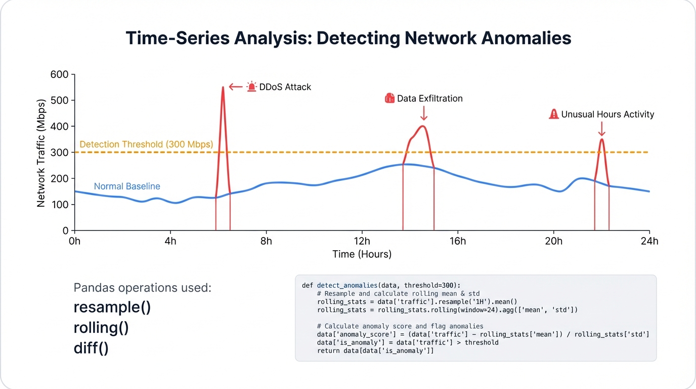
One of the most powerful time-series features is resampling. The .resample() method is time-based groupby that aggregates data over specific frequencies (per second, per minute). Invaluable for detecting time-based anomalies like Denial-of-Service attacks characterized by abnormally high traffic volume in short periods.
# Time-series example: Detecting a traffic spike (potential DoS attack)
# Create sample data with timestamps
timestamps = pd.to_datetime(['2023-10-27 10:00:01', '2023-10-27 10:00:01',
                            '2023-10-27 10:00:02', '2023-10-27 10:01:30',
                            '2023-10-27 10:01:30', '2023-10-27 10:01:30'])
bytes_transferred = [1200, 50000, 1500, 800, 1250, 1000]
time_series_df = pd.DataFrame({'bytes': bytes_transferred}, index=timestamps)

print("Original time-series data:")
print(time_series_df)

# Resample the data into 1-minute bins and sum the bytes in each bin
traffic_per_minute = time_series_df['bytes'].resample('1T').sum()

print("\nTotal bytes transferred per minute:")
print(traffic_per_minute)
Resampling quickly reveals a massive spike of 52,700 bytes in the first minute, a clear anomaly compared to 3,050 bytes in the second minute. This demonstrates how Pandas transforms raw event-level data into aggregated time-windowed features suitable for anomaly detection.
Chapter 4: Core Visualization and Plotting with Matplotlib
4.1 The Matplotlib Architecture: Figures, Axes, and the Object-Oriented API
Matplotlib is Python's foundational plotting library, providing the underlying engine for most visualization libraries including Seaborn. Understanding its architecture is key to creating sophisticated, highly customized visualizations essential for professional security analysis, composed of hierarchical objects:
- Figure: The top-level container for all plot elements. The entire canvas or window where everything draws. A single Figure can contain multiple subplots.
- Axes: The individual plot itself. An Axes object contains the data region, x- and y-axes (or z-axis for 3D), tick marks, labels, and plotted data (artists). Analysts interact with this object most frequently.
Matplotlib supports two primary coding styles:
- The pyplot API: Command-style functions making Matplotlib work like MATLAB. State-based, implicitly tracking current Figure and Axes. Convenient for quick interactive plotting (e.g.,
plt.plot(x, y)). - The Object-Oriented (OO) API: More powerful and flexible. Users explicitly create and track Figure and Axes objects, calling methods directly on them (e.g.,
fig, ax = plt.subplots(); ax.plot(x, y)).
For anything beyond simplest plots, the object-oriented API is strongly recommended. It provides explicit control over figures and components, making complex plots with multiple subplots and custom elements easier to manage. This report exclusively uses the OO style as best practice for reproducible, professional-grade security visualizations.
4.2 Building Blocks of Visualization: Line, Bar, Scatter, and Histogram Plots
The OO API provides Axes methods for all fundamental plot types. Each suits different analytical questions.
- Line Plot (ax.plot()): Ideal for trends over continuous intervals, most commonly time. In cybersecurity, plot traffic volume over time to spot spikes or dips indicating attacks or outages.
- Bar Chart (ax.bar()): Compare quantities across categories. Common use: display frequency of different attack types in datasets.
- Scatter Plot (ax.scatter()): Show relationships between two numerical variables. Identify correlations and clusters, like plotting flow duration against total packets to see if attacks cluster in specific regions.
- Histogram (ax.hist()): Visualize distribution of single numerical variables by binning data and showing frequency per bin. Useful for understanding statistical properties of features like packet size or inter-arrival time.
import matplotlib.pyplot as plt
import numpy as np

# Sample data for demonstration
attack_types = ['DoS', 'Port Scan', 'Web Attack', 'Brute Force']
counts = [1500, 800, 600, 300]
flow_durations = np.random.lognormal(mean=2, sigma=1, size=1000)
total_packets = flow_durations * np.random.uniform(5, 15, size=1000) + np.random.normal(0, 50, 1000)
total_packets[total_packets < 1] = 1

# Create a figure with two subplots (1 row, 2 columns)
fig, (ax1, ax2) = plt.subplots(1, 2, figsize=(14, 6))

# --- Plot 1: Bar chart of attack counts ---
ax1.bar(attack_types, counts, color=['red', 'orange', 'yellow', 'green'])
ax1.set_title('Frequency of Network Event Types')
ax1.set_ylabel('Number of Flows')
ax1.set_xlabel('Event Type')

# --- Plot 2: Scatter plot of duration vs. packet count ---
ax2.scatter(flow_durations, total_packets, alpha=0.5, edgecolors='k')
ax2.set_title('Flow Duration vs. Total Packets')
ax2.set_xlabel('Flow Duration (log scale)')
ax2.set_ylabel('Total Packets')
ax2.set_xscale('log')  # Use a log scale for better visualization of skewed data

# Display the figure
plt.tight_layout()
plt.show()
4.3 Customizing Visuals for Clarity and Impact in Security Reports
Matplotlib's primary value in professional security contexts is exhaustive customizability. Basic plots suffice for initial exploration, but formal incident reports or leadership presentations require clear, unambiguous, well-annotated visualizations. Matplotlib's OO API gives analysts control over virtually every canvas element.
Key customization techniques include:
- Titles and Labels: Setting clear titles (
ax.set_title()) and axis labels (ax.set_xlabel(),ax.set_ylabel()) is fundamental. - Colors, Linestyles, and Markers: Customize plotted data appearance for better differentiation and emphasis.
- Legends: Add legends (
ax.legend()) to identify different data series. - Annotations and Text: Add text (
ax.text()) or arrows (ax.annotate()) to highlight specific features like DDoS attack peaks or anomalous data clusters. - Gridlines and Spines: Control gridline appearance (
ax.grid()) and plot bounding box (spines) for aesthetic and functional purposes.
Professional Security Visualization:
High-level libraries generate visually pleasing plots quickly but often lack direct controls for specific modifications. A security operations center manager might require network bandwidth plots over 24 hours including red shaded regions highlighting exact attack duration, with annotations pointing to peak traffic rates and primary target IP addresses. This bespoke visualization level is where Matplotlib excels.
It provides tools moving beyond simple plotting to sophisticated data storytelling essential for communicating complex security events and business impact. Mastering the OO API enables analysts to produce not just graphs, but actionable security intelligence.
Chapter 5: Advanced Statistical Graphics with Seaborn
5.1 A High-Level Interface for Insightful Visuals
Seaborn is a visualization library built atop Matplotlib providing high-level declarative API for creating beautiful, informative statistical graphics. Matplotlib provides fundamental building blocks and granular control. Seaborn offers opinionated approaches with sensible defaults, making complex visualizations require minimal code. Its design goal makes visualization central to data exploration and understanding.
Seaborn's most significant advantage is deep Pandas DataFrame integration. Most plotting functions are "dataset-oriented," directly accepting DataFrames and interpreting column names for semantic mapping to plot aesthetics like x/y position, color (hue), size, style. This tight coupling dramatically simplifies code required to visualize relationships within structured data—the standard format for security datasets.
import seaborn as sns
import matplotlib.pyplot as plt
import pandas as pd

# Load a sample dataset (Seaborn comes with built-in datasets for examples)
tips = sns.load_dataset("tips")

# Create a relational plot using Seaborn
# Note how column names are passed directly as strings
sns.relplot(
    data=tips,
    x="total_bill", y="tip", col="time",
    hue="smoker", style="smoker", size="size"
)
plt.show()
This single function call produces multi-plot figures visualizing relationships between five variables—a task requiring significantly more Matplotlib code. This rapid generation of complex multi-faceted visualizations makes Seaborn unparalleled for exploratory data analysis.
5.2 Visualizing Distributions and Relationships in Network Data
Understanding statistical properties of network features is fundamental for building intrusion detection systems. Seaborn provides functions specifically for this purpose.
- Distribution Plots: Visualize single variable distributions (univariate analysis). Key functions include
histplot()for histograms,kdeplot()for smooth Kernel Density Estimates,ecdfplot()for Empirical Cumulative Distribution Functions. Figure-leveldisplot()creates all these types and can facet visualizations across categorical variables to compare distributions between groups (e.g., benign vs. malicious traffic). - Relational Plots: Understand relationships between two continuous variables (bivariate analysis). Main functions are
scatterplot()andlineplot(). Figure-levelrelplot()creates both, allowing mapping up to seven variables onto single figures using hue, size, style, faceting aesthetics. Extremely useful for exploring how relationships between two features like Flow Duration and Total Bytes change across different protocols or attack types.
5.3 Leveraging Categorical Plots, Heatmaps, and Pairplots for Multi-Dimensional Analysis
Many network security dataset features are categorical (Protocol, TCP Flag, Attack Type). Seaborn excels at visualizing relationships between categorical and numerical variables.
- Categorical Plots: Functions like
boxplot(),violinplot(),stripplot(),countplot()designed for this. Boxplots show packet length distributions per protocol (TCP, UDP, ICMP). Violinplots provide richer views combining box plots with kernel density estimates. Figure-levelcatplot()provides unified interfaces to all types. - Heatmaps: Graphical data representation where values depict by color. In cybersecurity, most critical application visualizes correlation matrices. Network datasets often suffer high multicollinearity (features highly correlated), negatively impacting some machine learning model performance.
sns.heatmap(df.corr())instantly creates visual matrices making correlations easy to spot, guiding feature selection. - Pairplots: The
pairplot()function powerfully gets quick high-level dataset overviews. Creates axis grids where each numerical variable shares across y-axes in single rows and x-axes in single columns. Diagonal plots show univariate distributions of each variable. Off-diagonal plots show bivariate relationships (scatter plots) between variable pairs. Adding hue parameters (e.g.,hue='label') lets analysts immediately see which features might effectively separate attack traffic from normal traffic.
Rapid Hypothesis Testing:
Seaborn's primary cybersecurity workflow role accelerates exploratory data analysis loops. Its declarative dataset-oriented API lets analysts rapidly generate and iterate on visualizations, testing hypotheses visually. Questions like "Do DoS attacks have different flow duration distributions than benign traffic?" get answered in single code lines (sns.kdeplot(data=df, x='Flow Duration', hue='Label')).
This speed enables broader, deeper data exploration in shorter timeframes, leading to more informed decisions in subsequent labor-intensive phases of feature engineering and model building.
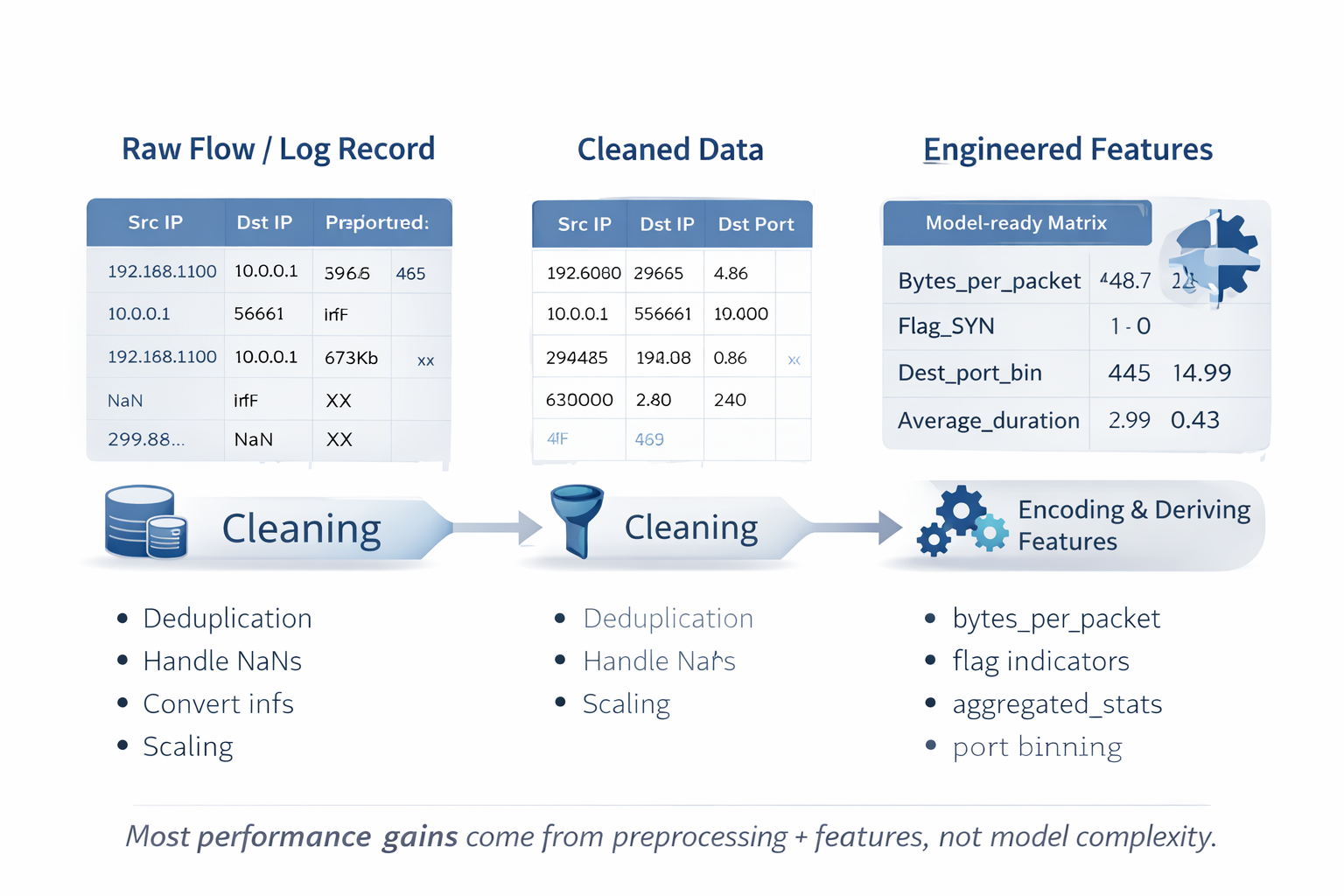
Chapter 6: Preprocessing and Feature Engineering for Network Traffic Data
6.1 The Criticality of Data Preparation in Intrusion Detection
In machine learning-based IDS pipelines, data preprocessing and feature engineering stages are arguably most critical and impactful. Machine learning models can't operate on raw network packets or unstructured log files directly. Raw data must transform into structured numerical formats—feature vectors—that algorithms understand. This transformation quality directly dictates final model performance, with sophisticated deep learning models trained on poorly prepared data invariably outperformed by simpler models trained on well-engineered features.
Common Data Challenges in Security:
- Noise and Inconsistency: Datasets contain missing values, infinite values from calculations like division by zero, duplicate records, artifacts from data collection processes.
- Mixed Data Types: Single network flow records mix numerical features (byte counts), categorical features (protocol type), text-based information.
- Varying Scales: Numerical features exist on vastly different scales. Flow Duration might be microseconds while Total Bytes reaches millions. Many algorithms are scale-sensitive.
- Irrelevant Information: Datasets often contain redundant features or features providing no discriminatory power for detecting attacks.
Effective preprocessing addresses these issues, creating clean, consistent, optimized datasets for model training.
| Technique | Description | Python/Scikit-learn Function | Use Case in Cybersecurity |
|---|---|---|---|
| StandardScaler | Transforms data to have a mean of 0 and a standard deviation of 1. | sklearn.preprocessing.StandardScaler | General-purpose scaler, useful for algorithms that assume a Gaussian distribution of features, like some linear models. |
| MinMaxScaler | Scales features to a given range, typically [0,1]. | sklearn.preprocessing.MinMaxScaler | Useful for algorithms sensitive to feature magnitude, such as neural networks and distance-based algorithms like k-NN. |
| One-Hot Encoding | Converts categorical features into a binary vector representation. | sklearn.preprocessing.OneHotEncoder | Used for nominal features like 'protocol' or 'state' where there is no inherent order. Prevents the model from assuming a false ordinal relationship (e.g., that UDP > TCP). |
| Label Encoding | Converts categorical labels into integer values. | sklearn.preprocessing.LabelEncoder | Primarily used for the target variable (the labels). Can be used for features if there is a clear ordinal relationship, but this is rare in network data. |
| SMOTE | Creates synthetic samples for the minority class to balance the dataset. | imblearn.over_sampling.SMOTE | Addresses severe class imbalance where attack samples are rare, preventing the model from being biased towards predicting the 'benign' class. |
| RandomUnderSampler | Randomly removes samples from the majority class to balance the dataset. | imblearn.under_sampling.RandomUnderSampler | An alternative to SMOTE for class imbalance, useful when the dataset is very large and reducing its size is desirable for faster training. |
6.2 Techniques for Normalization and Scaling Numerical Features
Numerical features in network data often have disparate scales. Algorithms relying on distance calculations (k-Nearest Neighbors, Support Vector Machines) or gradient descent (neural networks) can be heavily biased by large-magnitude features. Scaling ensures all features contribute equally to model learning.
- StandardScaler (Z-score Normalization): Transforms each feature to mean 0 and standard deviation 1. Common default choice but sensitive to outliers.
- MinMaxScaler: Transforms each feature to specific ranges, usually [0,1]. Less sensitive to standard deviation, useful for algorithms expecting inputs in bounded intervals.
- RobustScaler: Removes median and scales data according to interquartile range (IQR). Robust to outliers extremely common in security data (e.g., massive DDoS attacks create outlier values in byte and packet counts).
- Log Transformation: For highly skewed distributions (e.g., flow duration where most flows are short but few are very long), applying logarithmic transformation (
np.log1p) can make distributions more normal, improving some model performance.
6.3 Strategies for Encoding Categorical Data
Machine learning algorithms require numerical input, so categorical features must convert. The encoding strategy choice is critical and depends on feature nature.
- Label Encoding: Assigns unique integers to each category (TCP=0, UDP=1, ICMP=2). Simple but use cautiously for features as it can introduce artificial ordinal relationships models might misinterpret (implying ICMP > UDP > TCP). Safest for target variables.
- One-Hot Encoding: Most common and safest method for nominal categorical features. Creates new binary (0 or 1) columns for each unique category. For 'protocol' feature, creates three columns: 'protocol_TCP', 'protocol_UDP', 'protocol_ICMP'. TCP protocol flows have 1 in 'protocol_TCP' column, 0s in others. Avoids false ordinal assumptions but can lead to large feature dimension increases (high dimensionality) if categorical variables have many unique values.
6.4 Addressing Class Imbalance
A persistent critical challenge in intrusion detection is class imbalance. Real-world networks have benign traffic volume orders of magnitude greater than malicious traffic. Models trained on imbalanced datasets likely achieve high accuracy simply by always predicting majority class ('benign'), making them useless for detecting attacks.
Two primary strategies combat this:
- Undersampling: Reduces samples in majority class. Random Undersampling randomly discards majority class samples until desired balance achieved. Effective for very large datasets but risks losing potentially useful information.
- Oversampling: Increases samples in minority class. Most sophisticated method is SMOTE (Synthetic Minority Over-sampling Technique). Instead of duplicating minority samples, SMOTE creates new synthetic samples by interpolating between existing minority instances, providing models with more diverse attack behavior examples to learn from.
6.5 Domain-Specific Feature Engineering
Beyond standard preprocessing, the most impactful improvements often come from feature engineering: using domain knowledge to create new features from existing ones. This is where security analyst expertise becomes powerful for amplifying adversary activity signals. While standard preprocessing cleans data, feature engineering translates abstract attack concepts into concrete mathematical representations models easily learn.
Domain-Specific Feature Engineering Examples:
- Ratio Features: Creating ratios capturing fundamental relationships. For example,
bytes_per_packet = total_bytes / total_packetshelps distinguish bulk data transfers from small interactive packets. - Time-based Aggregation: Using groupby operations on source IPs over time windows to create features like
flows_per_second,unique_ports_contacted,avg_packet_size. Highunique_ports_contactedvalues in short time windows strongly indicate port scans. - Protocol-Specific Features: Parsing protocol flags to create binary features. For TCP traffic, creating features for SYN, FIN, RST flags can be highly informative for identifying different connection stages or specific scanning techniques.
- Binning: Converting numerical features into categorical ones. For instance, destination port numbers can bin into categories like 'Well-Known' (0-1023), 'Registered' (1024-49151), 'Dynamic/Private' (49152-65535). Attacks often target specific well-known ports, making this useful.
This intelligent feature creation process elevates standard machine learning pipelines to highly effective context-aware intrusion detection systems.
Chapter 7: Case Study I - Unpacking the CICIDS2017 Dataset for Intrusion Detection
7.1 Dataset Overview: Structure, Features, and Attack Scenarios
The CICIDS2017 dataset, developed by the Canadian Institute for Cybersecurity, was created to address shortcomings of older intrusion detection datasets by providing more realistic comprehensive benchmarks. It features modern attack scenarios and benign background traffic generated from abstract human behavior profiles to better resemble real-world network activity.
Data was captured over five days from Monday July 3 to Friday July 7, 2017. Monday's traffic is exclusively benign while subsequent days contain mixed benign traffic and various attacks executed at specific times. The dataset provides two primary formats: raw packet captures (PCAP files) and processed bidirectional network flow data in CSV files, generated using CICFlowMeter tool extracting over 80 statistical features from network traffic like flow duration, packet counts, byte counts, inter-arrival times.
The dataset's strength lies in attack diversity chosen based on contemporary threat reports. Attack scenarios are well-documented and cover common intrusion techniques.
| Attack Category | Specific Attack Types Included | Day of Occurrence |
|---|---|---|
| Brute Force | FTP-Patator, SSH-Patator | Tuesday |
| DoS / DDoS | GoldenEye, Hulk, Slowhttptest, Slowloris, LOIT | Wednesday, Friday |
| Heartbleed | Heartbleed Exploit | Wednesday |
| Web Attack | Brute Force, XSS, SQL Injection | Thursday |
| Infiltration | Dropbox Download, Cool disk exploit | Thursday |
| Botnet | ARES | Friday |
| Port Scan | Various scan types (nmap) | Friday |
7.2 Workflow: Exploratory Data Analysis with Pandas and Seaborn
Thorough exploratory data analysis is the first and most crucial step analyzing any security dataset, especially ones as large and complex as CICIDS2017. This process reveals fundamental data characteristics and potential challenges.
Step 1: Loading and Initial Inspection
The dataset distributes across eight separate CSV files. First step loads these files into single Pandas DataFrames and performs initial inspection.
import pandas as pd
import numpy as np
import seaborn as sns
import matplotlib.pyplot as plt
import glob

# Use glob to find all CSV files in the directory
path = 'path/to/your/CICIDS2017/MachineLearningCSV/'
all_files = glob.glob(path + "/*.csv")

# Read and concatenate all files into a single DataFrame
df_list = [pd.read_csv(filename) for filename in all_files]
df = pd.concat(df_list, ignore_index=True)

# Clean up column names (remove leading/trailing spaces)
df.columns = df.columns.str.strip()

# Initial inspection
print(df.info())
print(df.head())
Step 2: Visualizing Attack Distributions
A primary IDS dataset characteristic is class imbalance. A simple countplot immediately visualizes this issue, showing 'BENIGN' class dominates while some attack types are extremely rare.
plt.figure(figsize=(12, 8))
sns.countplot(y=df['Label'])
plt.title('Distribution of Attack Types in CICIDS2017')
plt.xlabel('Number of Flows')
plt.ylabel('Label')
plt.xscale('log')  # Use a log scale due to extreme imbalance
plt.show()

print(df['Label'].value_counts())
This visualization makes clear that any model trained on raw data will heavily bias towards predicting 'BENIGN'.
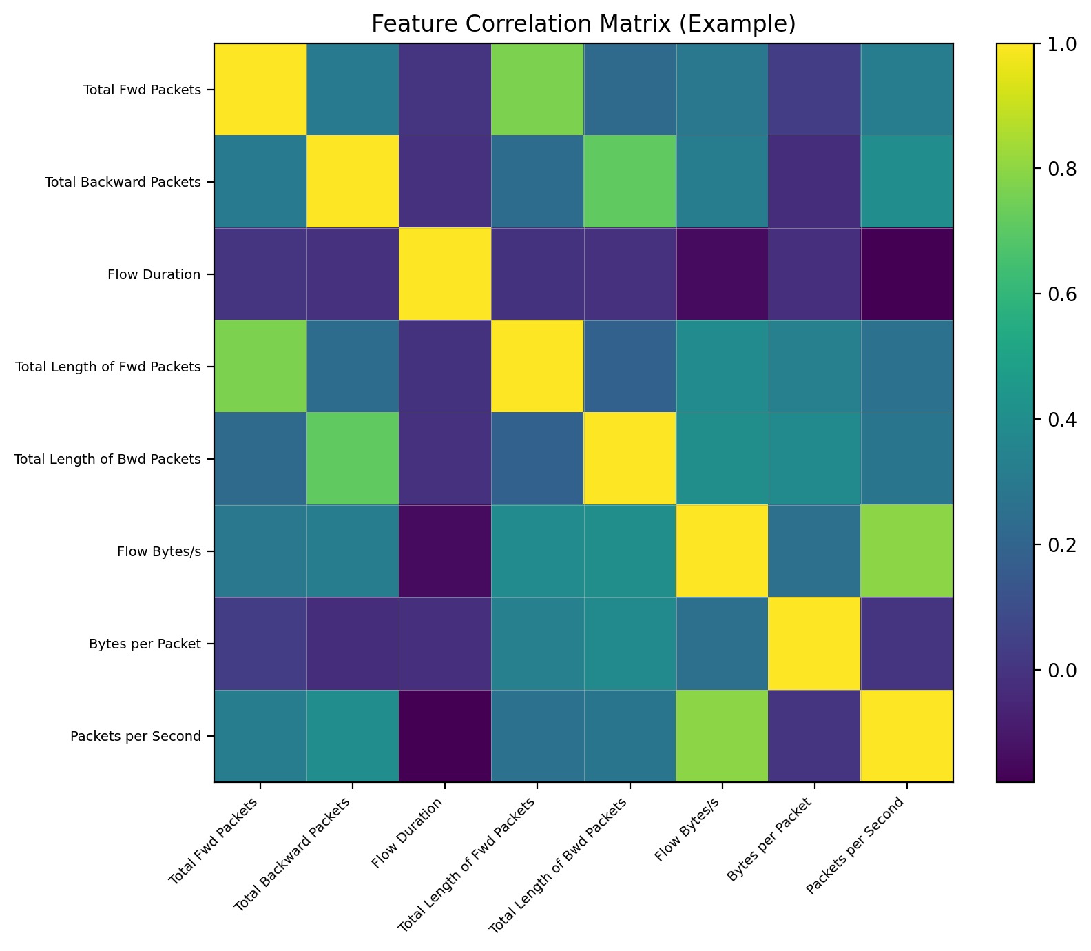
Step 3: Analyzing Feature Correlations
Network flow features are often highly correlated. For example, total bytes in flows likely correlate with total packets. Heatmaps provide quick visual diagnoses of this multicollinearity.
# Select only numeric columns for correlation calculation
numeric_df = df.select_dtypes(include=np.number)

# Calculate the correlation matrix
corr_matrix = numeric_df.corr()

# Plot the heatmap
plt.figure(figsize=(18, 15))
sns.heatmap(corr_matrix, cmap='viridis')
plt.title('Feature Correlation Matrix for CICIDS2017')
plt.show()
Resulting heatmaps show bright squares along diagonals indicating groups of highly correlated potentially redundant features.
7.3 Workflow: Data Preprocessing and Cleaning
Before any modeling, datasets must be rigorously cleaned.
Step 1: Handling Data Inconsistencies
CICIDS2017 is known to contain non-finite values (NaN, inf) requiring handling. Additionally, research pointed out CICFlowMeter logic flaws like creating "TCP appendices" acting as data artifacts. Robust cleaning removes these problematic records.
# Drop rows with NaN or infinite values
df.replace([np.inf, -np.inf], np.nan, inplace=True)
df.dropna(inplace=True)

# Check the shape after cleaning
print(f"Shape of DataFrame after dropping non-finite values: {df.shape}")
Step 2: Feature Scaling and Encoding
For this workflow, the goal is binary classification (attack vs. benign). The 'Label' column encodes accordingly. Numerical features then scale.
from sklearn.preprocessing import StandardScaler, LabelEncoder

# Binary classification: benign vs. attack
df['Label'] = df['Label'].apply(lambda x: 0 if x == 'BENIGN' else 1)

# Separate features (X) and target (y)
X = df.drop('Label', axis=1)
y = df['Label']

# Identify numerical features for scaling
numerical_features = X.select_dtypes(include=np.number).columns

# Apply StandardScaler
scaler = StandardScaler()
X[numerical_features] = scaler.fit_transform(X[numerical_features])
Step 3: Balancing the Dataset
To mitigate extreme class imbalance, random undersampling is effective for datasets of this size.
from imblearn.under_sampling import RandomUnderSampler

# Define the undersampling strategy
# For instance, keep all minority (attack) samples and reduce majority (benign) samples
rus = RandomUnderSampler(random_state=42)
X_resampled, y_resampled = rus.fit_resample(X, y)

print("Class distribution after undersampling:")
print(y_resampled.value_counts())
7.4 Workflow: Visualizing Network Attack Patterns
Visualization is key to understanding how attack traffic differs from benign traffic.
Differentiating Traffic with Distribution Plots
By comparing key feature distributions for benign traffic versus specific attack types, we identify distinguishing characteristics. DoS attacks often involve high rates of small packets over short durations.
# Note: This requires the original multi-class labels before binary encoding
# Let's reload a small sample for this specific visualization
sample_df = pd.read_csv(all_files[0]) # Load one of the files with attacks
sample_df.columns = sample_df.columns.str.strip()
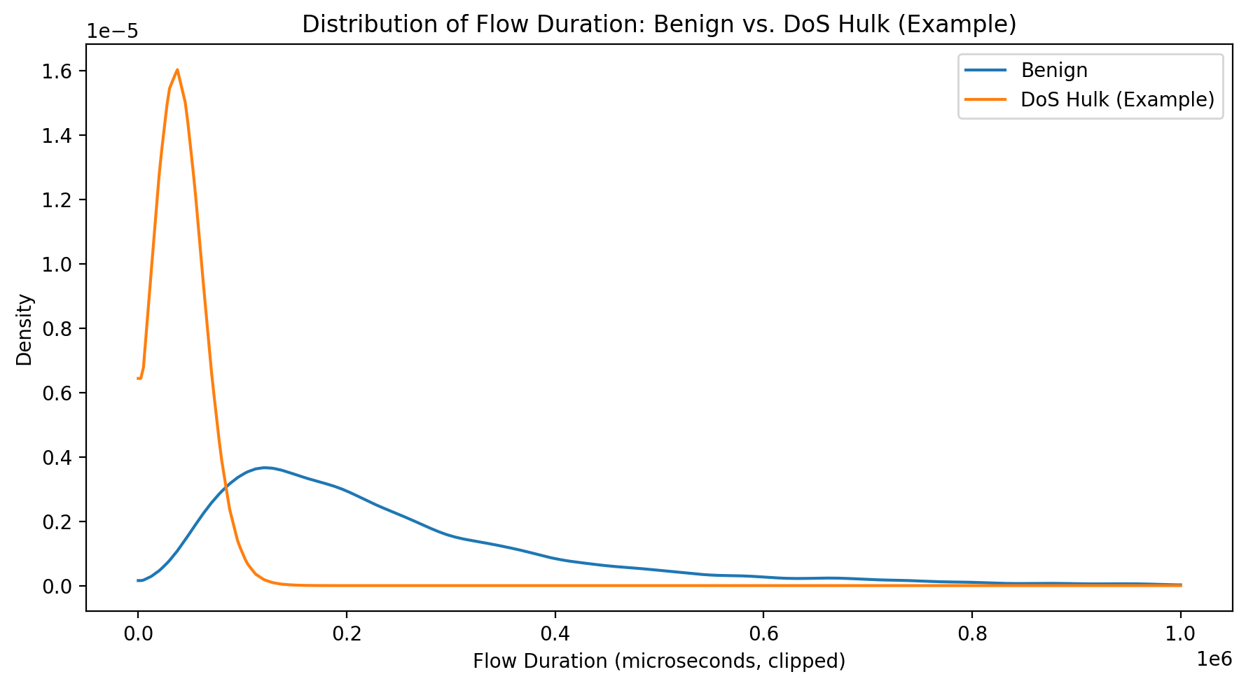
# Compare Flow Duration for Benign vs. DoS Hulk attacks
plt.figure(figsize=(10, 6))
sns.kdeplot(data=sample_df[sample_df['Label'] == 'BENIGN'], x='Flow Duration', label='Benign', clip=(0, 1e6))
sns.kdeplot(data=sample_df[sample_df['Label'] == 'DoS Hulk'], x='Flow Duration', label='DoS Hulk', clip=(0, 1e6))
plt.title('Distribution of Flow Duration: Benign vs. DoS Hulk')
plt.xlabel('Flow Duration (microseconds, clipped)')
plt.legend()
plt.show()This plot would likely show DoS Hulk flows concentrated at very short durations while benign flows have wider distributions.
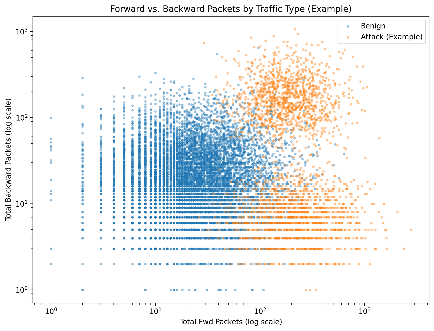
Identifying Attack Signatures with Scatter Plots
Scatter plots reveal if different attack types occupy distinct spaces in two-dimensional feature planes.
# Use a smaller, balanced sample for a clearer plot
df_sample = df.sample(n=50000, random_state=42)

plt.figure(figsize=(12, 8))
sns.scatterplot(data=df_sample, x='Total Fwd Packets', y='Total Backward Packets', hue='Label', alpha=0.5)
plt.title('Forward vs. Backward Packets by Traffic Type')
plt.xscale('log')
plt.yscale('log')
plt.show()
Such plots might reveal certain attacks (e.g., involving large data transfers) cluster in areas of high forward and backward packet counts, distinct from bulk benign traffic.
Critical Lesson from CICIDS2017:
CICIDS2017 analysis serves as crucial lesson. While it's a rich dataset, its known flaws and artifacts mean achieving high accuracy scores isn't the end goal. True value lies in discovery process—using exploratory data analysis and visualization to critically examine data, understand limitations, and build models based on genuine traffic patterns rather than dataset-specific quirks. This forensic approach to data validation is core skill for any cybersecurity data scientist.
Chapter 8: Case Study II - Anomaly Detection in the UNSW-NB15 Dataset
8.1 Dataset Overview: Modern Synthetic and Real-World Attacks
UNSW-NB15 dataset was created by Australian Centre for Cyber Security in 2015 to provide more modern comprehensive benchmarks for evaluating Network Intrusion Detection Systems than older datasets like KDD99. It was generated using IXIA PerfectStorm tool to create hybrids of real-world benign network traffic and synthetically generated contemporary attack behaviors.
The dataset consists of 49 features extracted from raw network traffic using Argus and Bro-IDS tools. These features categorize into Flow, Basic, Content, Time, additional generated features. The full dataset contains over 2.5 million records but is most commonly used via pre-defined training and testing partitions containing 175,341 and 82,332 records respectively.
A key UNSW-NB15 characteristic is inclusion of nine modern attack categories reflecting more current threat landscapes.
| Attack Category | Description |
|---|---|
| Fuzzers | Sending malformed or random data to a service to cause a crash or find vulnerabilities. |
| Analysis | Port scanning, sniffing, and other traffic analysis techniques. |
| Backdoors | Bypassing normal authentication to gain unauthorized access. |
| DoS | Denial-of-Service attacks aimed at making a service unavailable. |
| Exploits | Taking advantage of a software vulnerability to cause unintended behavior. |
| Generic | A catch-all for various block-cipher-based attacks against cryptographic systems. |
| Reconnaissance | Information gathering and footprinting to identify targets and vulnerabilities. |
| Shellcode | Injecting a small piece of code as a payload to gain control of a compromised system. |
| Worms | Self-replicating malware that spreads across a network. |
8.2 Workflow: Exploratory Data Analysis to Identify Challenges
UNSW-NB15 is known for complexity, making thorough exploratory data analysis phases essential to understand challenges before modeling.
Step 1: Initial Data Exploration
Workflow begins loading training and testing sets and combining them for holistic exploratory data analysis. Initial cleaning involves stripping whitespace from column names and categorical values.
import pandas as pd
import numpy as np
import seaborn as sns
import matplotlib.pyplot as plt

# Load the datasets
df_train = pd.read_csv('path/to/your/UNSW_NB15_training-set.csv')
df_test = pd.read_csv('path/to/your/UNSW_NB15_testing-set.csv')

# Combine for EDA
df = pd.concat([df_train, df_test], ignore_index=True)

# Basic inspection
print(df.info())

# Clean categorical feature values (example for 'attack_cat')
df['attack_cat'] = df['attack_cat'].str.strip()
Step 2: Uncovering Feature Relationships with a Pairplot
Pairplots on small feature subsets colored by binary labels provide rapid visual assessments of which features might be good discriminators.
# Select a few potentially interesting features for the pairplot
selected_features = ['dur', 'sbytes', 'dbytes', 'sttl', 'label']
df_sample = df[selected_features].sample(n=2000, random_state=42)

sns.pairplot(df_sample, hue='label', palette={0: 'blue', 1: 'red'})
plt.show()
This plot might reveal, for instance, attack traffic (label=1) tends to have specific values for sttl (source time-to-live) features.
Step 3: Correlation Analysis with a Heatmap
A well-documented UNSW-NB15 challenge is high multicollinearity degrees among features. Heatmaps are most effective for visualizing this.
# Calculate correlation matrix on numerical features
numeric_cols = df.select_dtypes(include=np.number).columns
corr_matrix = df[numeric_cols].corr()

plt.figure(figsize=(20, 18))
sns.heatmap(corr_matrix, cmap='coolwarm')
plt.title('Feature Correlation Matrix for UNSW-NB15')
plt.show()
Heatmaps show numerous bright red and blue squares off main diagonals indicating strong positive and negative correlations, signaling feature selection will be critical to avoid model instability and redundancy.
Step 4: Visualizing Class Overlap with PCA and t-SNE
Another significant challenge is overlap between different attack classes and even between attack and normal traffic. Dimensionality reduction techniques help visualize this high-dimensional problem in 2D.
from sklearn.preprocessing import StandardScaler, LabelEncoder
from sklearn.decomposition import PCA

# Prepare data for PCA: select numeric, scale, and encode labels
df_pca = df.copy()
numeric_cols = df_pca.select_dtypes(include=np.number).columns.drop(['id', 'label'])
df_pca[numeric_cols] = StandardScaler().fit_transform(df_pca[numeric_cols])
df_pca['attack_cat_encoded'] = LabelEncoder().fit_transform(df_pca['attack_cat'])

# Apply PCA
pca = PCA(n_components=2)
principal_components = pca.fit_transform(df_pca[numeric_cols])
pca_df = pd.DataFrame(data=principal_components, columns=['PC1', 'PC2'])
pca_df['attack_cat'] = df_pca['attack_cat']

# Visualize the result
plt.figure(figsize=(14, 10))
sns.scatterplot(x='PC1', y='PC2', hue='attack_cat', data=pca_df, palette='tab10', alpha=0.7)
plt.title('UNSW-NB15 Data Projected onto 2 Principal Components')
plt.show()
Resulting scatter plots likely show significant mixing and overlap between clusters, visually confirming class separation difficulty.
8.3 Workflow: Advanced Feature Engineering and Selection
Given challenges identified in exploratory data analysis, sophisticated preprocessing pipelines are required.
Step 1: Handling Categorical Features
Nominal features like proto, service, state must be one-hot encoded for use in most models.
Step 2: Feature Selection
To address high dimensionality and multicollinearity, feature selection steps are essential. Tree-based models like XGBoost or Random Forest are excellent for this, providing feature importance measures.
from sklearn.ensemble import RandomForestClassifier

# Prepare data (assuming it's already cleaned and encoded)
# For simplicity, we'll use label encoding for categorical features here
df_fs = df.drop(['id', 'attack_cat'], axis=1).copy()
for col in ['proto', 'service', 'state']:
    df_fs[col] = df_fs[col].astype('category').cat.codes

X = df_fs.drop('label', axis=1)
y = df_fs['label']

# Train a Random Forest to get feature importances
rf = RandomForestClassifier(n_estimators=100, random_state=42, n_jobs=-1)
rf.fit(X, y)

# Create a DataFrame of feature importances
importances = pd.DataFrame({'feature': X.columns, 'importance': rf.feature_importances_})
importances = importances.sort_values('importance', ascending=False).set_index('feature')

# Plot the top 20 most important features
plt.figure(figsize=(10, 8))
importances.head(20).plot(kind='barh', legend=False)
plt.title('Top 20 Most Important Features')
plt.gca().invert_yaxis()
plt.show()

# Select the top N features for the model
top_features = importances.head(20).index.tolist()
X_selected = X[top_features]
8.4 Workflow: Visualizing Anomalies and Attack Clusters
With reduced more meaningful feature sets, we create more insightful visualizations.
Comparing Feature Distributions
Violinplots effectively compare key feature distributions across all attack categories simultaneously, revealing which features are most useful for multi-class classification.
# Use the original DataFrame with the multi-class 'attack_cat' label
# And one of the top features identified, e.g., 'sttl'
plt.figure(figsize=(15, 8))
sns.violinplot(data=df, x='sttl', y='attack_cat', orient='h')
plt.title('Distribution of Source TTL (sttl) by Attack Category')
plt.show()
This plot might show 'Normal' traffic has very different sttl distributions compared to 'Generic' or 'Exploits' attacks, confirming its importance as feature.
Key Insight from UNSW-NB15:
UNSW-NB15 analysis makes clear that as security datasets more closely mimic real-world network complexity, analytical challenges shift. It moves from simple classification towards more nuanced problems of signal separation from noise. High feature correlation and class overlap mean predictive model performance is less a function of algorithm choice and more a result of intelligence applied during feature engineering and selection. In this context, visualization isn't a final presentation step; it's an indispensable diagnostic tool used throughout workflows to understand data's inherent complexity and guide creation of features making anomalies detectable.
Chapter 9: Synthesis and Strategic Recommendations
9.1 Key Insights from the Case Studies
Comprehensive analyses of CICIDS2017 and UNSW-NB15 datasets, while both focused on network intrusion detection, reveal distinct but equally important lessons for cybersecurity data scientists. The journey through these datasets underscores a critical overarching principle: there is no universal "black box" solution for security analytics, with each dataset representing unique network environments and threat landscapes demanding bespoke analytical workflows guided by rigorous visualization-driven exploratory data analysis.
CICIDS2017 case study highlighted paramount importance of data integrity and critical consumption. Primary challenges weren't algorithmic but foundational: severe class imbalance and more subtly, potential artifacts from data generation processes like "TCP appendices" identified in research. The key takeaway is achieving high accuracy scores on datasets is meaningless if models learn to exploit data flaws rather than genuine malicious patterns. Analysts' first duty is acting as data forensic investigators using visualization and statistical tests to validate dataset soundness before entrusting it to models.
In contrast, UNSW-NB15 case study presented different challenges centered on data complexity. Here issues were high feature dimensionality, strong multicollinearity, significant overlap between attack classes. This environment shifts analyst focus from data cleaning to sophisticated signal separation. The UNSW-NB15 lesson is in realistic complex network environments, raw features are often insufficient, with success almost entirely dependent on quality of feature engineering and feature selection pipelines. Analysts must move beyond mere model operators to become feature designers using domain knowledge to construct new variables making subtle attack signals mathematically apparent.
Synthesizing these experiences, it becomes clear Python data ecosystem isn't just a set of model-building tools but a comprehensive workbench for deconstructing, understanding, and reconstructing security data to make it amenable to analysis.
9.2 Best Practices for a Python-Based Security Analytics Pipeline
Based on detailed workflows and findings from case studies, best practices emerge for any security analytics project leveraging Python data ecosystem. Adherence to these principles significantly improves robustness, reproducibility, real-world efficacy of resulting intrusion detection systems.
Essential Best Practices:
- Prioritize Visualization-Driven Exploratory Data Analysis: Exploratory data analysis shouldn't be cursory preliminary steps. It is continuous guiding process for entire projects. Use libraries like Seaborn and Matplotlib to relentlessly question data: What are distributions? Where is imbalance? Which features correlate? Do attack classes form distinct clusters? Answers to these questions should dictate every subsequent decision in preprocessing and modeling pipelines.
- Adopt a Critical Stance Towards Datasets: Public datasets are invaluable resources but not infallible. Essential to investigate data generation and collection methodologies. Be aware of potential biases, artifacts, errors that could compromise model validity. Use analytical tools to probe for these inconsistencies before committing to modeling strategies.
- Elevate Feature Engineering Over Model Complexity: Case studies consistently demonstrate greatest performance gains come from intelligent data preparation not using most complex algorithms. Simple logistic regression models with well-engineered features outperform complex neural networks with raw unrefined data. Invest majority of time understanding data and creating features explicitly representing behaviors you're trying to detect.
- Use Visualization as Core Diagnostic Tool: Beyond exploratory data analysis, visualization is critical for model diagnostics. Plotting confusion matrices, ROC curves, precision-recall curves provides much richer understanding of model performance than single-point metrics like accuracy. For anomaly detection, visualizing model decision boundaries on dimensionally-reduced datasets reveals how they separate normal from anomalous activity.
- Ensure Rigorous Documentation and Reproducibility: Security analytics workflows involve numerous steps, transformations, parameter choices. Meticulously document each decision in code comments or notebooks. Use version control systems like Git to track code and analysis changes. This discipline is essential for ensuring results are reproducible, auditable, can reliably deploy into production environments.
9.3 Future Directions: Integrating Advanced AI and Deep Learning Models
Foundational skills in data manipulation, preprocessing, visualization detailed in this report are absolute prerequisites for advancing into next frontiers of AI-driven cybersecurity. As fields evolve, more complex models from deep learning and explainable AI apply to security data.
- Deep Learning: Models like Recurrent Neural Networks (RNNs) and Long Short-Term Memory (LSTM) networks are well-suited for analyzing sequential time-series nature of network traffic. Convolutional Neural Networks (CNNs) can learn patterns from raw packet data represented as images. However, these models are even more sensitive to data quality and feature representation than classical machine learning counterparts. Robust preprocessing and feature engineering pipelines established in this report are foundations upon which these advanced models must be built.
- Explainable AI (XAI): As AI models increasingly deploy in critical security roles, ability to understand why models make certain predictions becomes crucial. XAI techniques like SHAP (SHapley Additive exPlanations) and LIME (Local Interpretable Model-agnostic Explanations) help demystify "black box" models. Applying these techniques effectively requires deep understanding of features that went into models—understanding built during exploratory data analysis and feature engineering phases.
The Foundation for Advanced AI:
Ultimately, journeys into advanced AI for cybersecurity begin with mastering fundamentals. Ability to wield NumPy, Pandas, Matplotlib, Seaborn with expertise and domain awareness transforms raw data into high-quality fuel required to power next generation of intelligent cyber defense systems.
The path forward requires continuous learning, experimentation, adaptation. As threat landscapes evolve and new attack vectors emerge, security data scientists must remain agile, always ready to apply these foundational tools to new challenges. Python data ecosystem provides flexibility and power needed to stay ahead of adversaries but only when wielded by analysts who understand both technical capabilities and security domains they serve.
Success in AI-driven cybersecurity isn't about having the most sophisticated algorithm—it's about having the deepest understanding of your data and the creativity to engineer features that expose what others miss.